OOHPod Parcel Locker UI Redesign
Project Context:
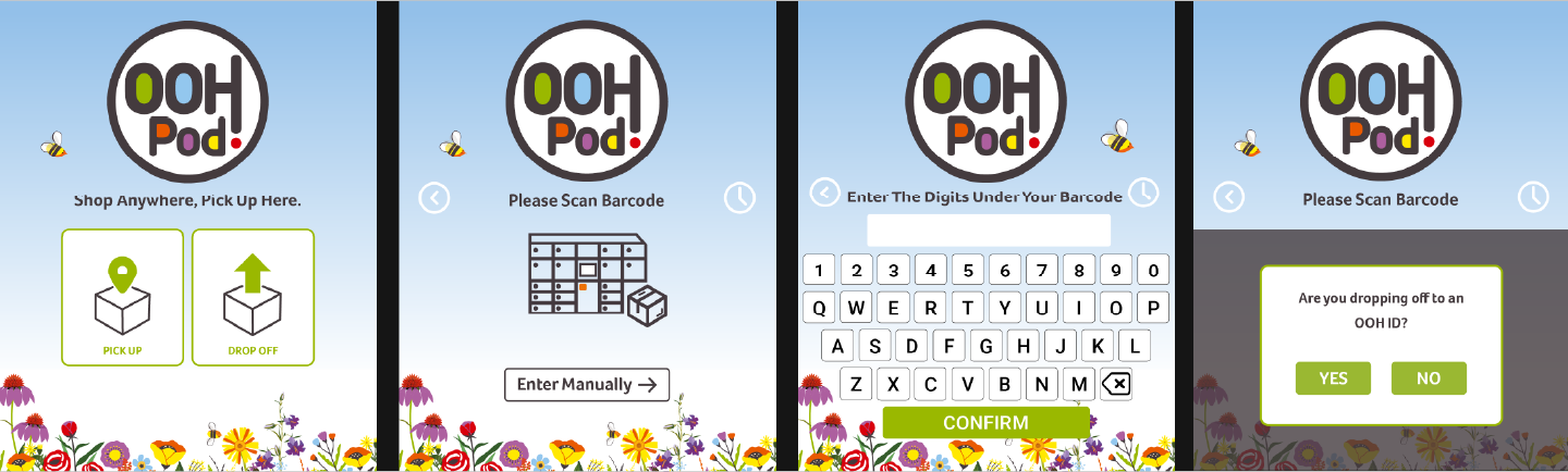
OOHPod was upgrading its parcel lockers with a new hardware model that features a smaller, 10-inch screen—down from the previous 24-inch model. This shift required a complete redesign of the locker interface to ensure usability, accessibility, and clarity within the constraints of the smaller display.
OOHPod was upgrading its parcel lockers with a new hardware model that features a smaller, 10-inch screen—down from the previous 24-inch model. This shift required a complete redesign of the locker interface to ensure usability, accessibility, and clarity within the constraints of the smaller display.
My Role:
I was responsible for redesigning the entire screen UI and user flow to optimise the experience across all user types, while accommodating the smaller screen and aligning with accessibility standards.
I was responsible for redesigning the entire screen UI and user flow to optimise the experience across all user types, while accommodating the smaller screen and aligning with accessibility standards.
Challenges Identified in the Previous Design:
Screen Clutter: The UI was overcrowded and difficult to navigate.
Inaccessible Colours: Poor colour contrast and non-compliant color usage.
Inconsistent Sizing: Fonts and icons varied widely in size and style.
Unclear Icons: Many icons were not intuitive or universally understood.
Legibility Issues: The on-screen keyboard and UI elements were hard to read in various lighting conditions, especially outdoors.
Redesign Goals:
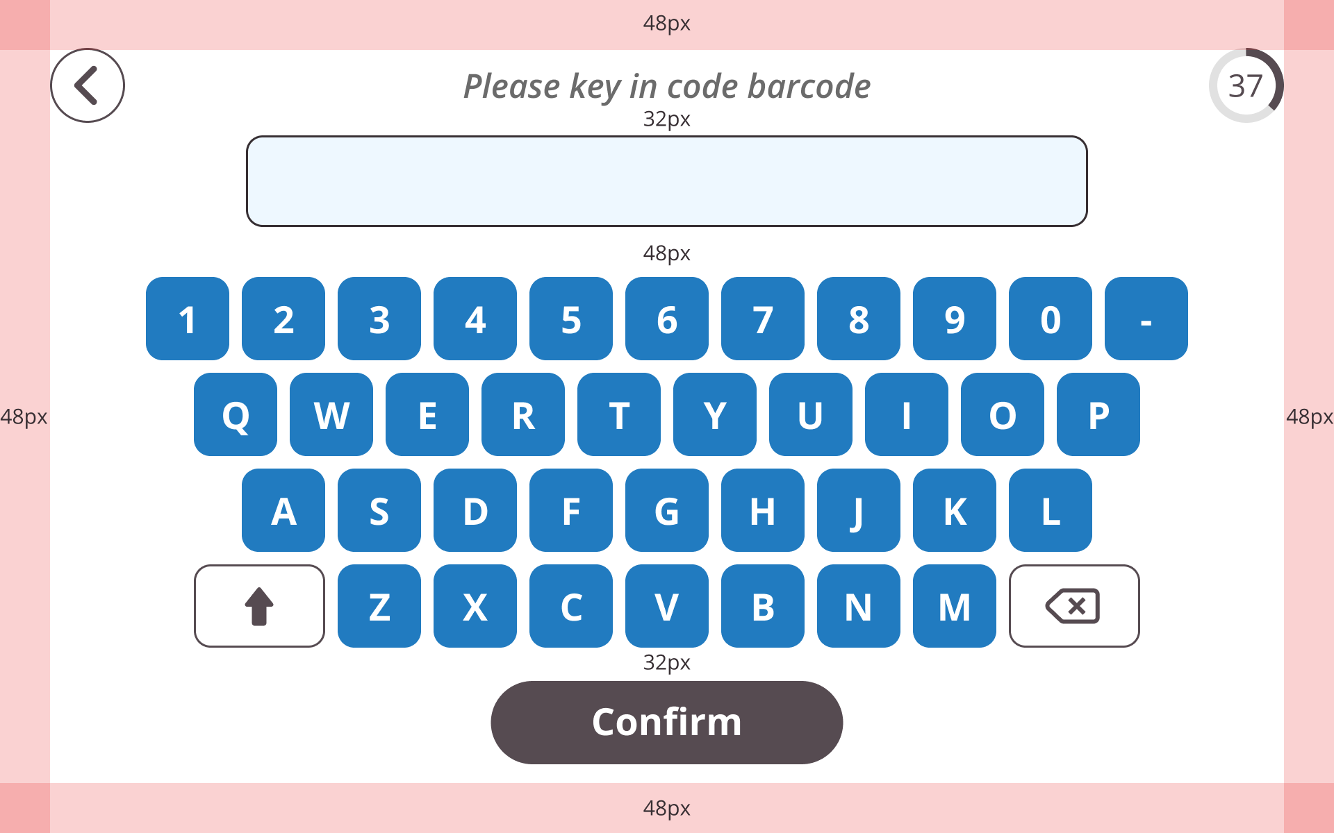
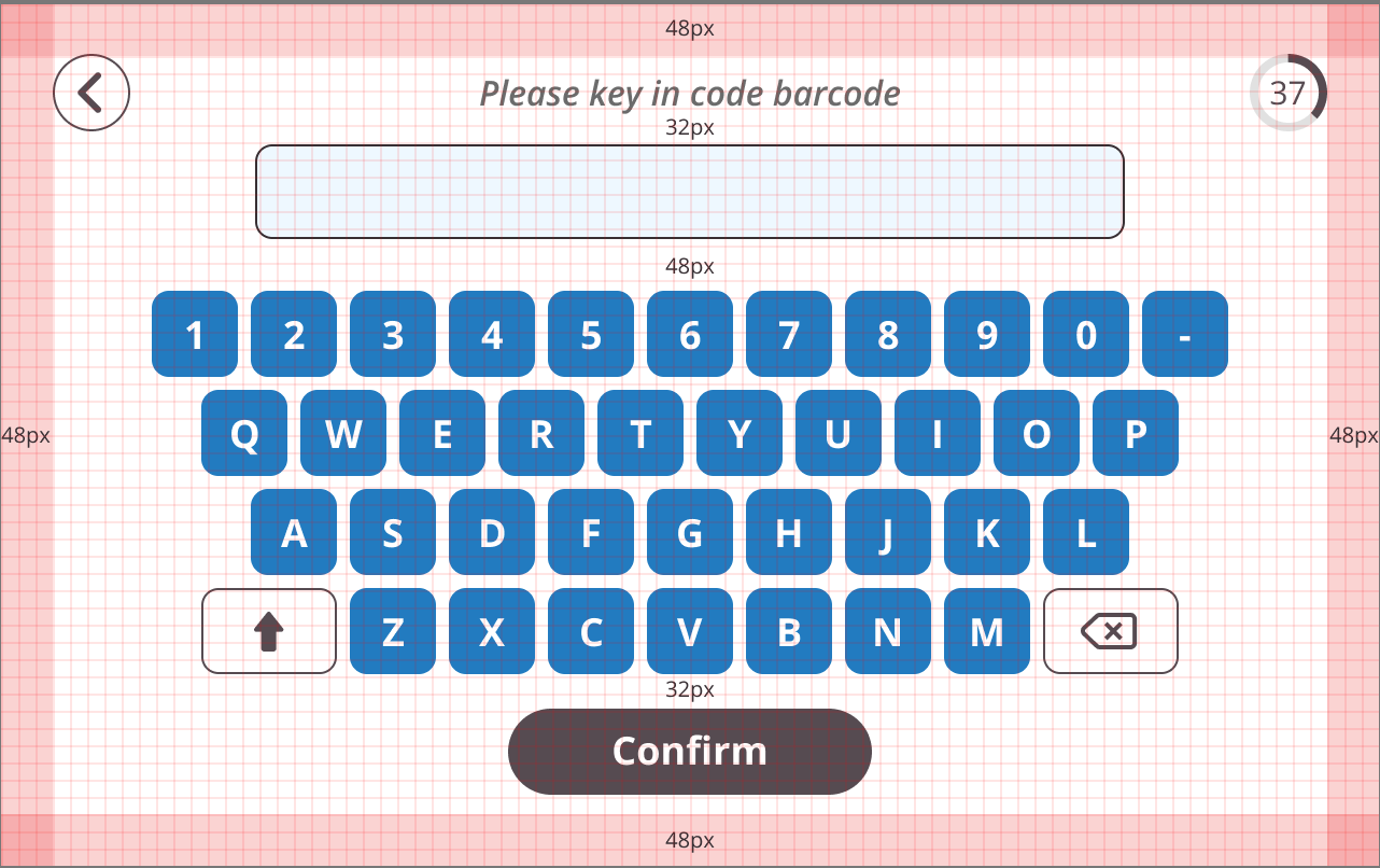
Optimize for a 10-inch Display: Maintain functionality while simplifying layout and flow.
Improve Accessibility: Enhance legibility, color contrast, and icon clarity.
Streamline User Journeys: Make the UI intuitive for all user types: customers, couriers, and admins.
Key Improvements:
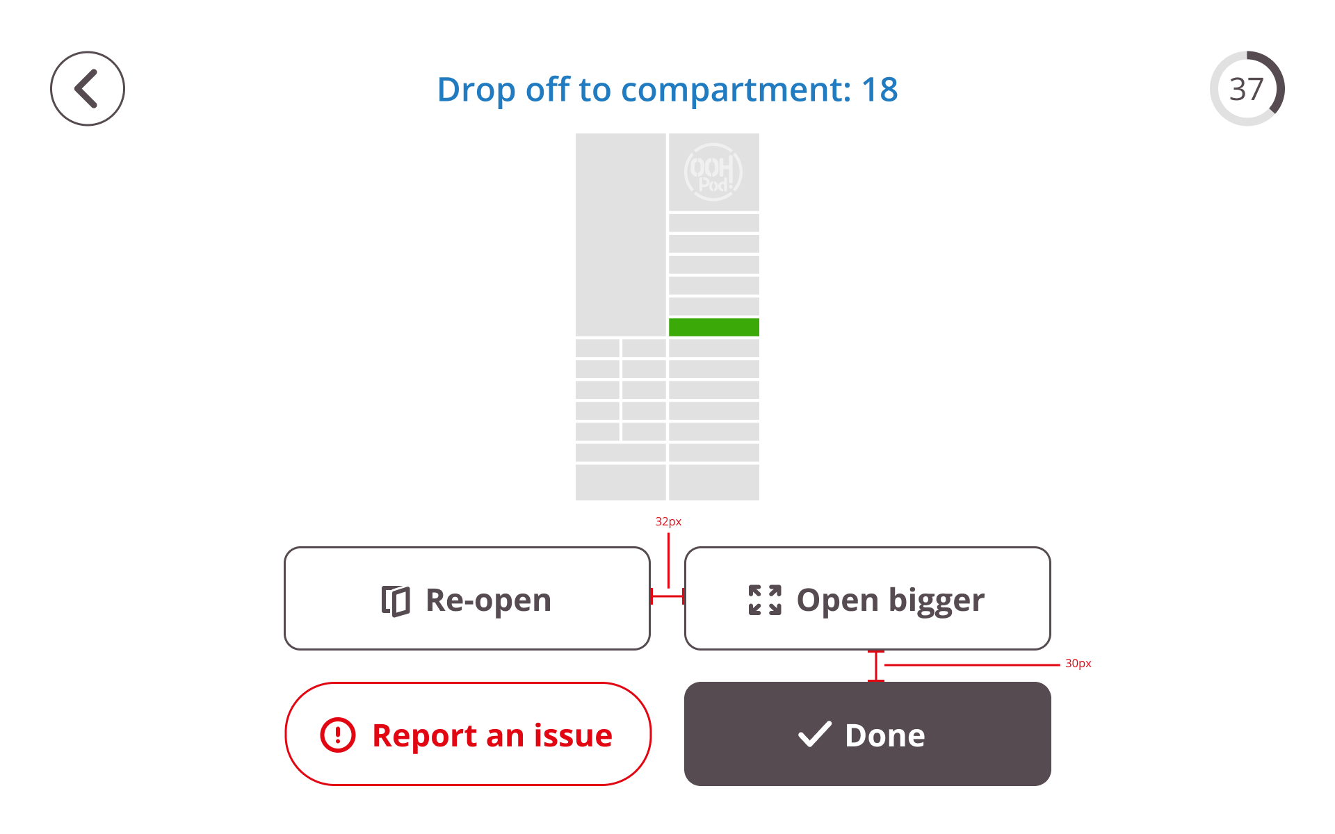
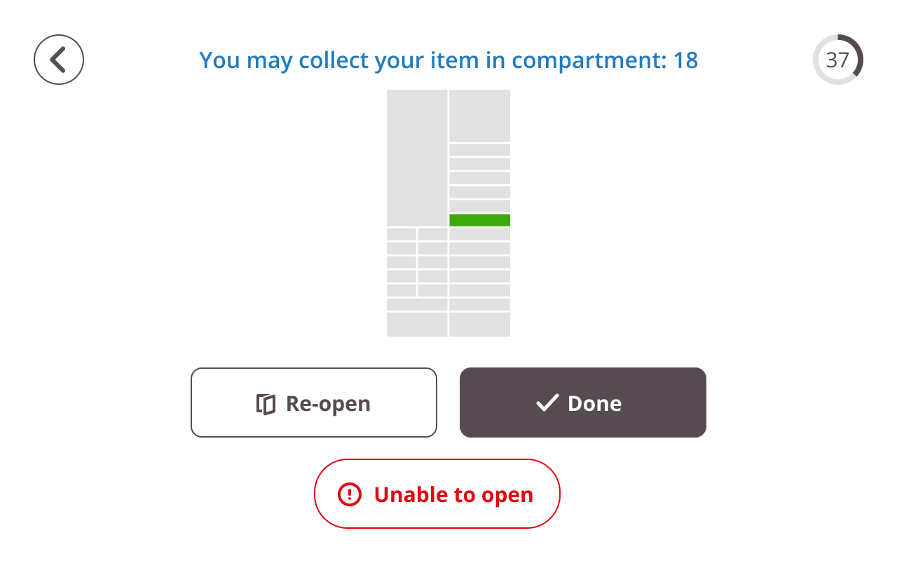
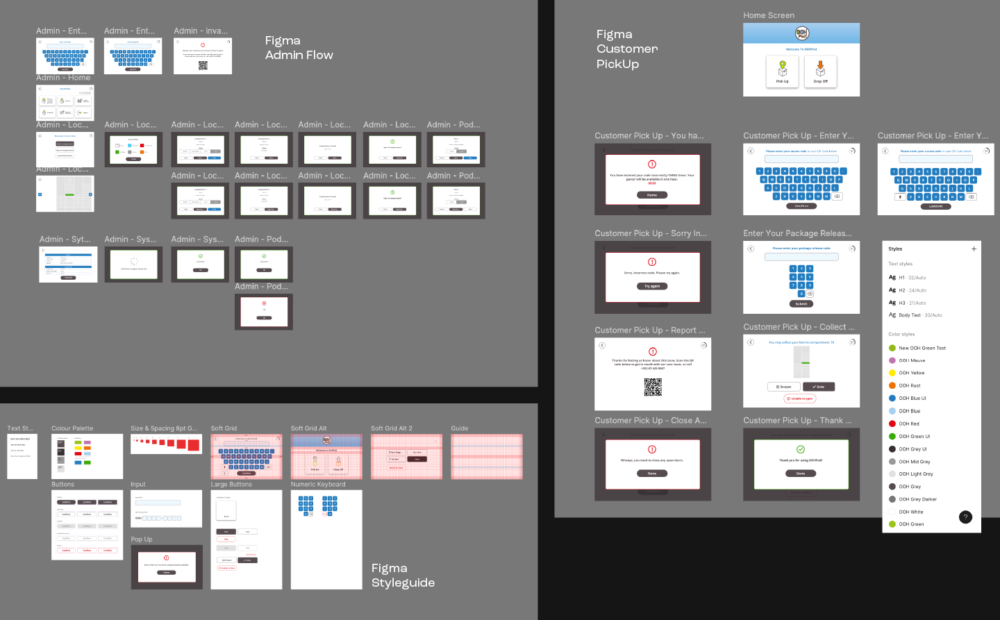
Grid-Based Layout: I implemented a consistent grid system to create structure and clarity.
Accessible Design:
Retained brand colours while introducing accessible supporting colours for critical UI elements like buttons.
Chose legible font sizes and ensured WCAG-compliant contrast ratios.
Used a white background to maximise contrast in various lighting environments.
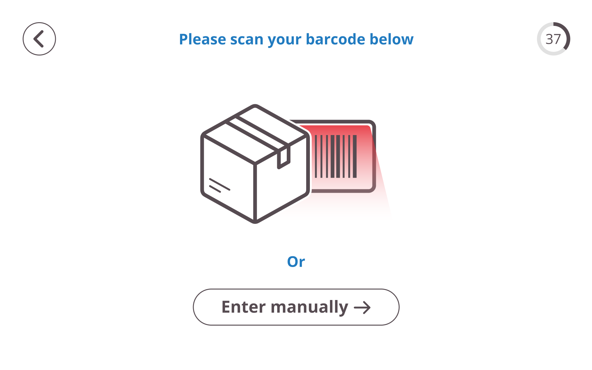
Iconography & Illustrations:
Introduced friendly, easily understandable icons and illustrations.
Ensured consistency in sizing and styling.
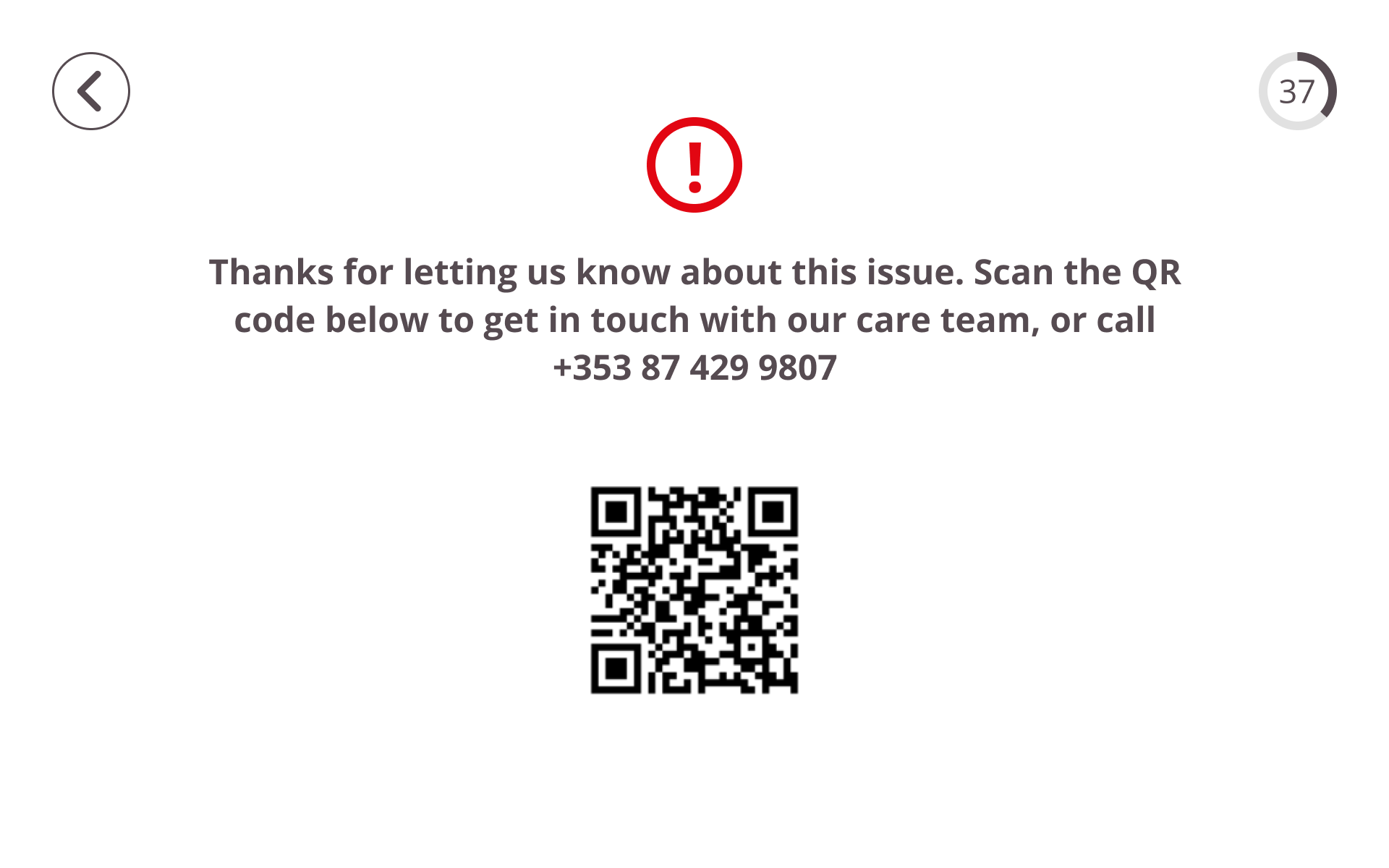
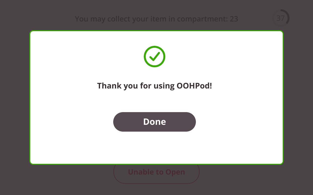
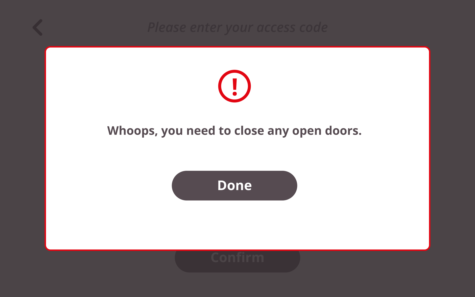
Improved UX Copy:
Simplified language for clearer instruction and navigation.
Tailored messaging to each user type.
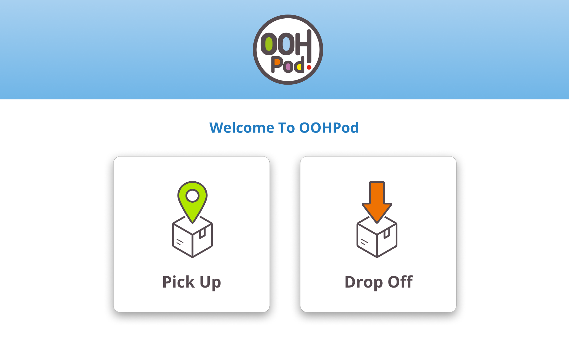
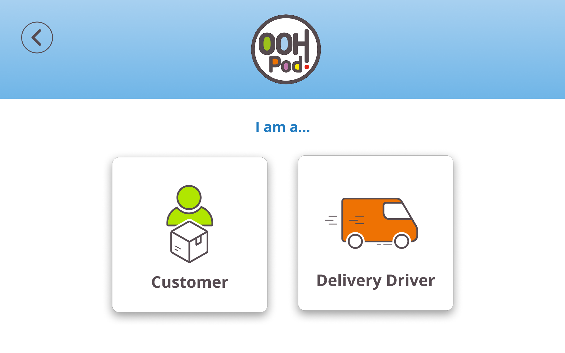
Distinctive User Flows:
Designed clear, distinguishable journeys for:
Customer Pick-Up
Customer Drop-Off
Courier Pick-Up
Courier Drop-Off
Admin Access
Used colour cues and visual elements to make customer vs. courier flows instantly recognisable.
Outcome:
The redesigned interface provides a significantly improved experience on smaller screens, supports accessibility for a broader range of users, and clearly guides customers, couriers, and admins through their tasks with ease and confidence.