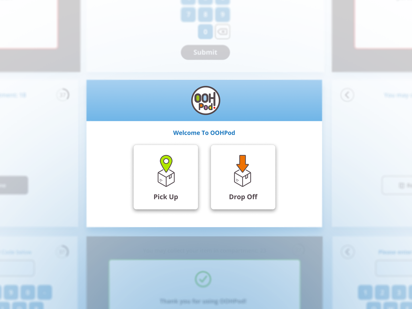
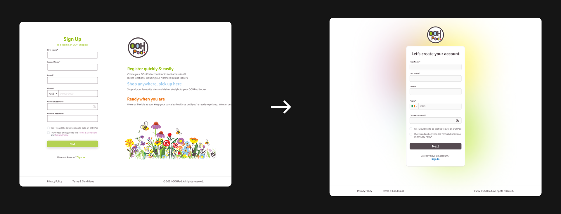
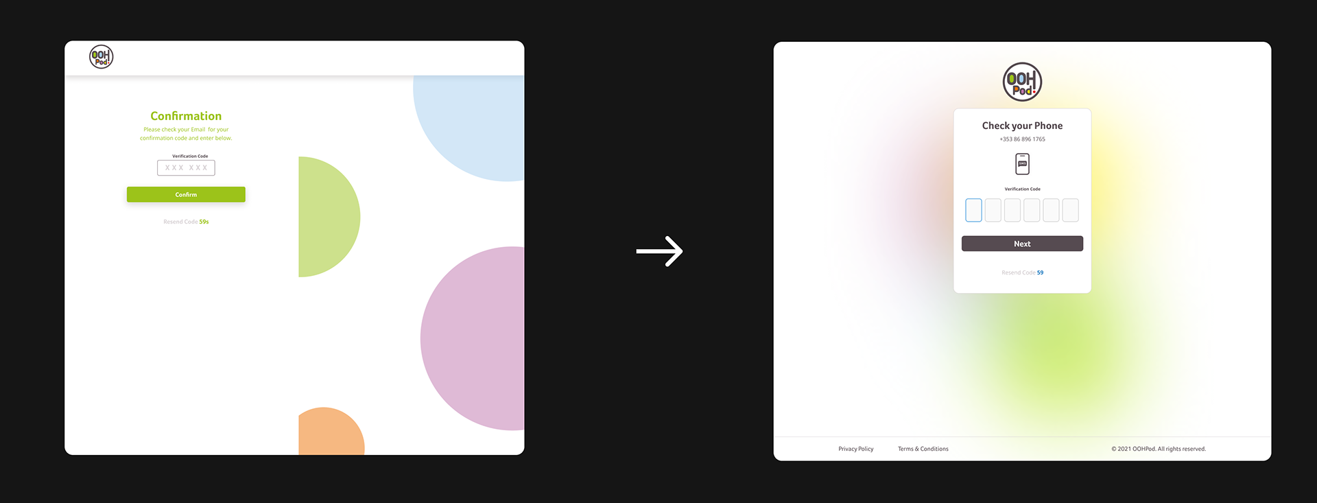
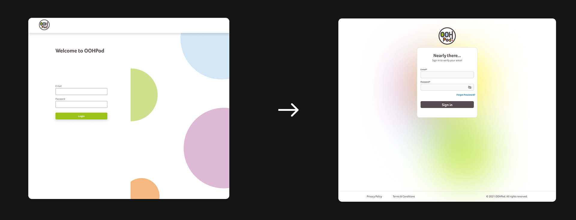
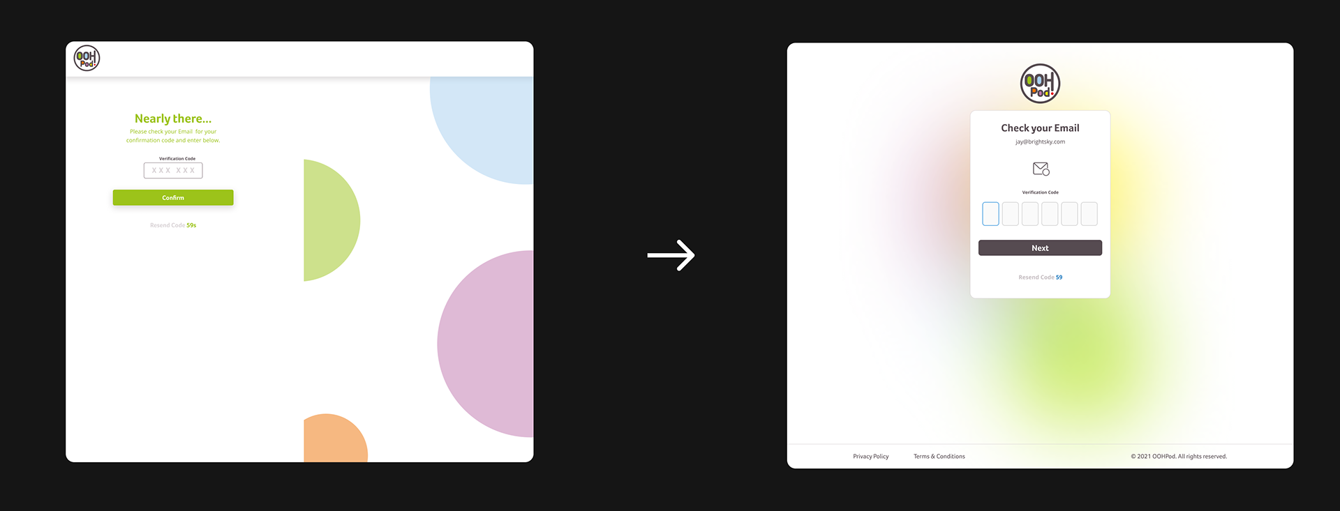
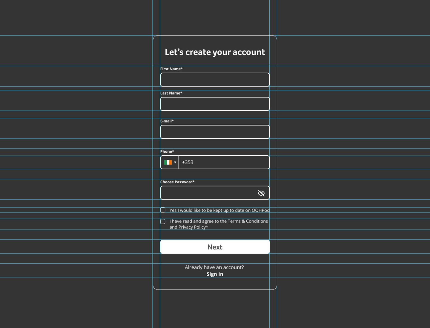
I led the redesign of the OOHPod sign-up journey to address user feedback around confusion and lack of clarity during the two-factor verification process. Users were required to verify both their email and mobile number—an important security step, as OOHPod securely stores users’ parcels—but many found it unclear when and where to take action.
Following UX research and testing, I introduced several improvements to streamline and clarify the experience:
- Simplified UI layout using centered card components to reduce visual clutter
- Clearer UX copy to guide users through each verification step
- Micro-animations to gently prompt users to check their email or phone at the appropriate time
- Improved legibility through adjusted font sizes and visual hierarchy
- Updated button colours to meet WCAG accessibility standards, ensuring better contrast and inclusivity for all users. These included the brand colour "OOH Warm Grey" and a new "OOH Blue UI".
These changes led to a significantly more intuitive and accessible onboarding flow, supporting OOHPod’s mission to deliver a secure and seamless parcel experience.
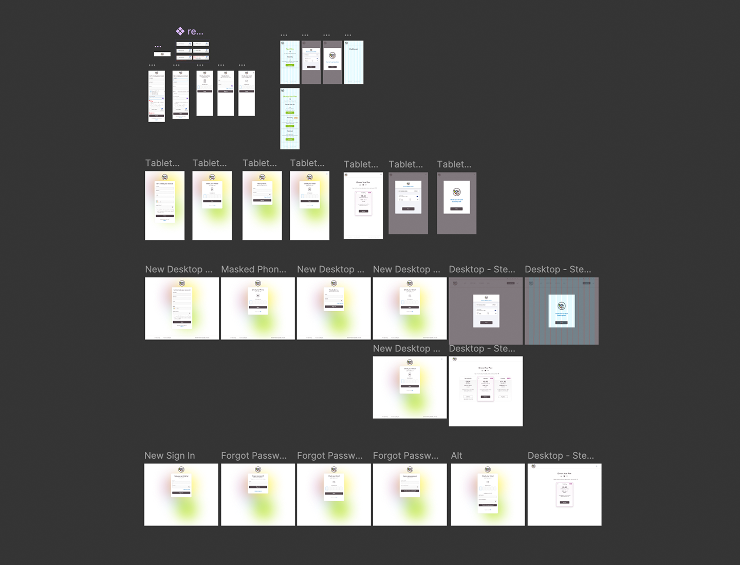


Mobile Screens & Prototype