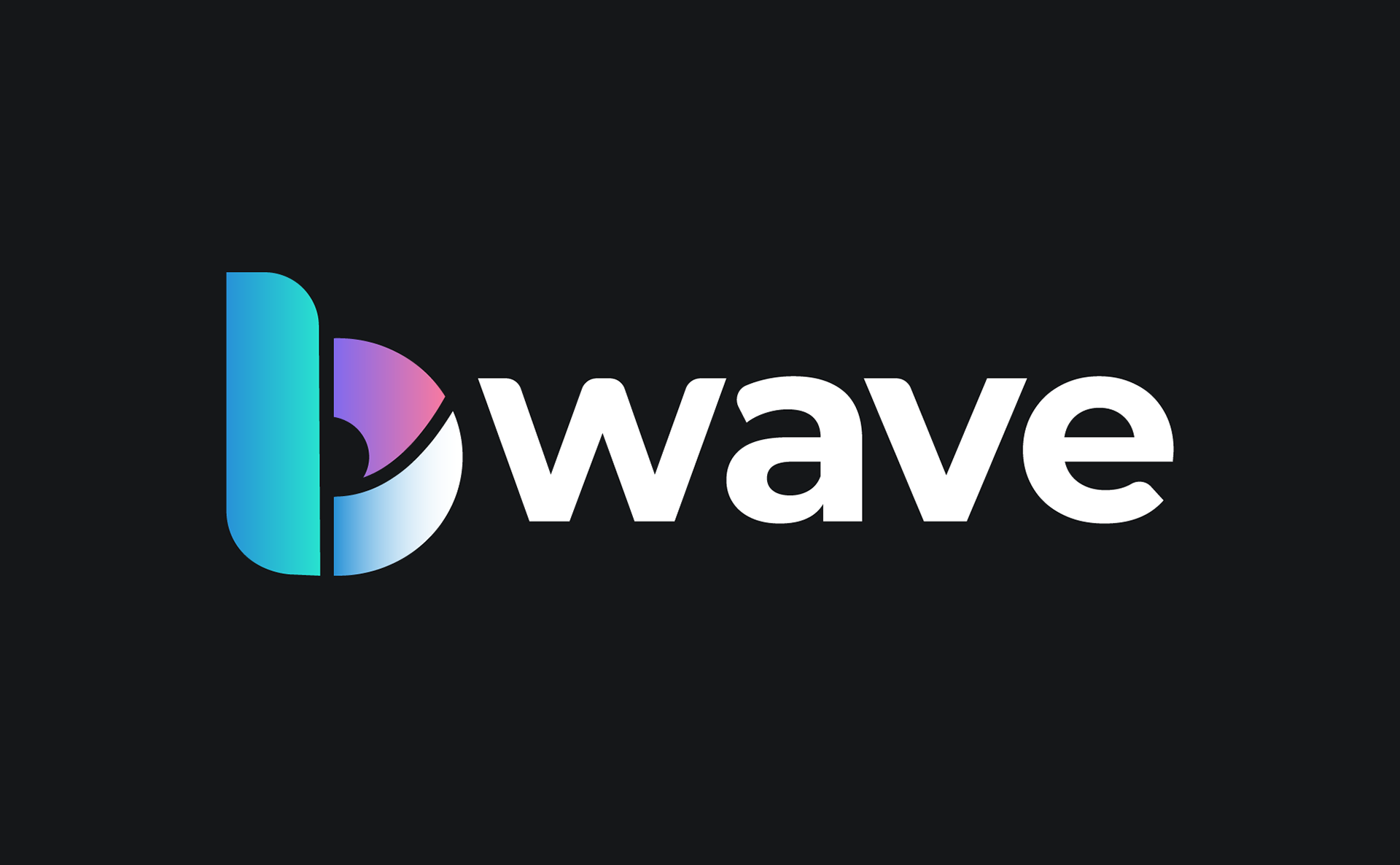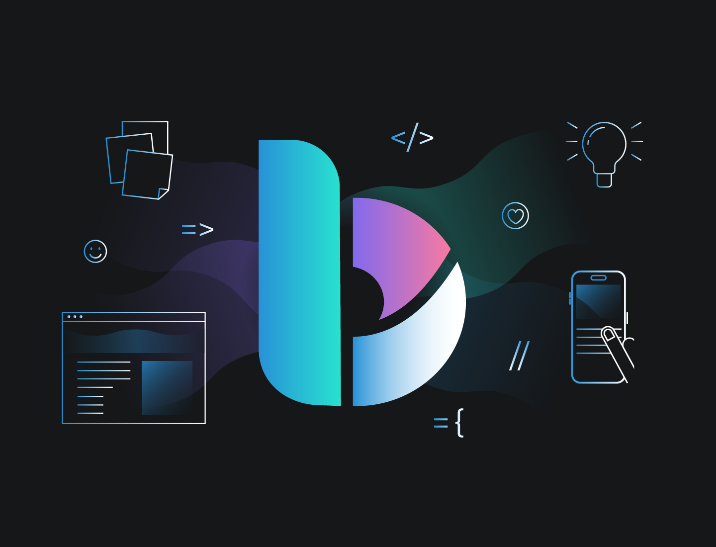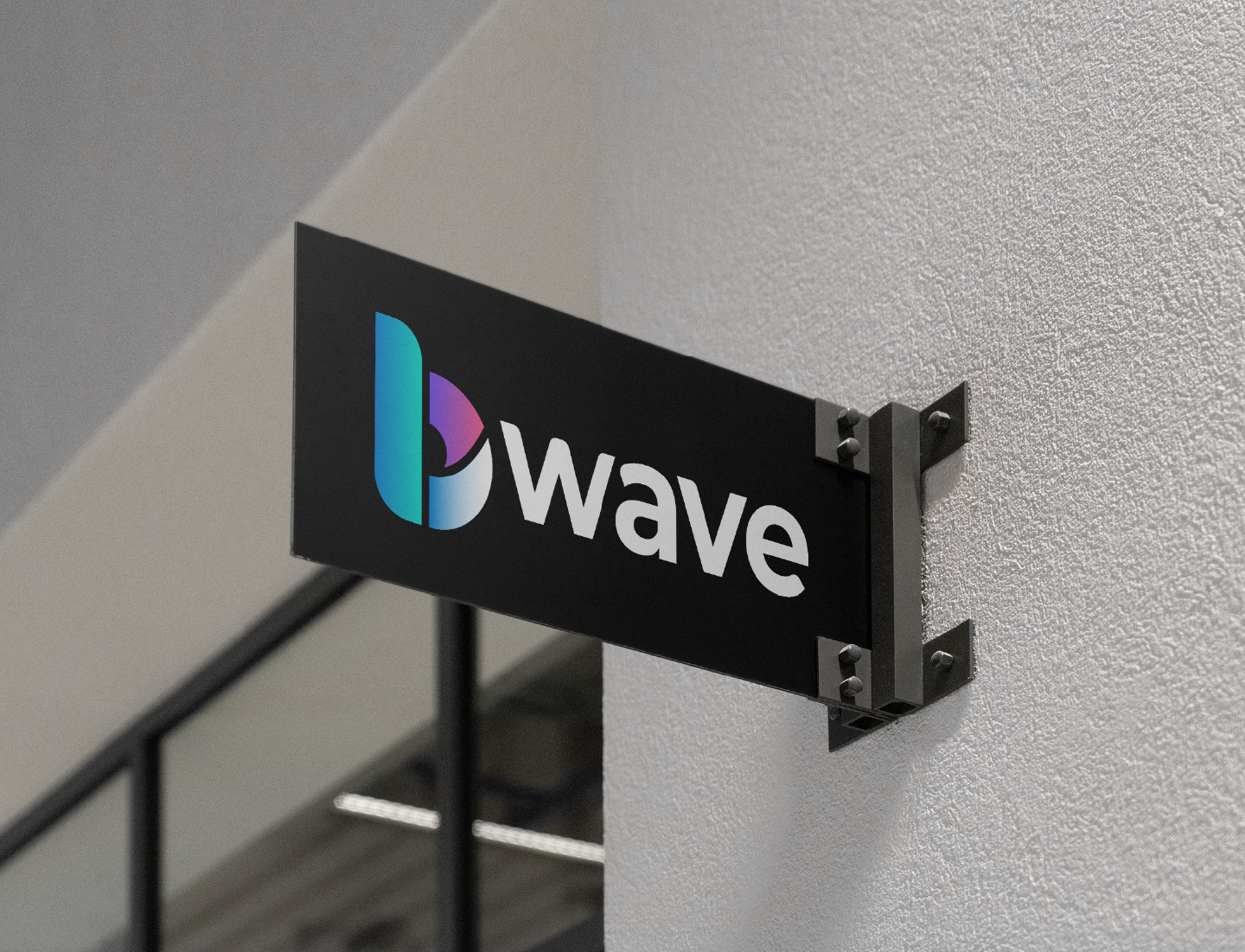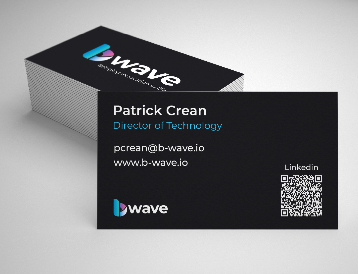
I created the new visual identity for B-wave, a rebrand of the digital consultancy formerly known as Bright Sky Digital. Founded in Brighton in 2010, the company wanted its updated branding to subtly reference its coastal roots while signalling a modern, forward-facing direction.
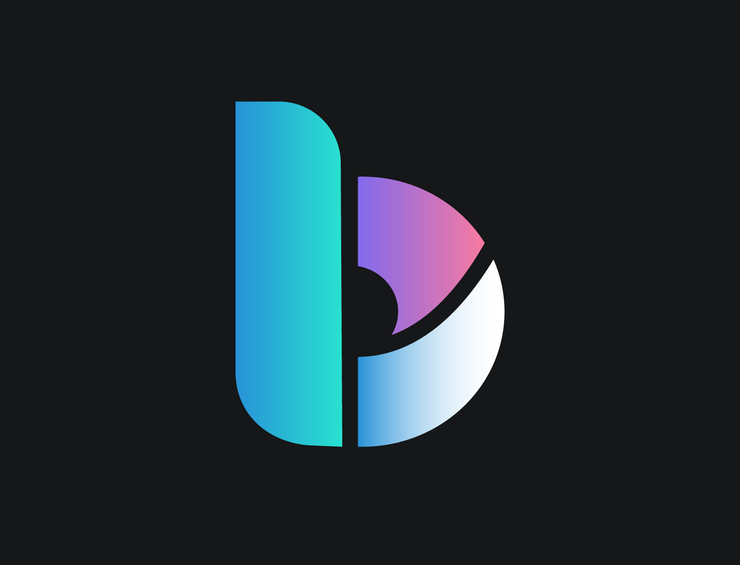
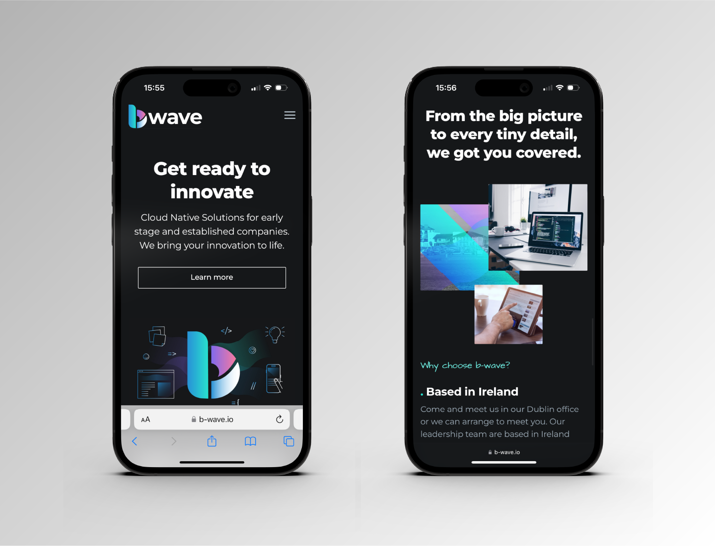
The b-wave icon is a stylised lowercase ‘b’ with fluid, natural curves—evoking both the motion of ocean waves and the continuous flow of digital transformation. The wordmark and icon were designed for flexibility, working seamlessly across digital platforms, social media, print, and the web.