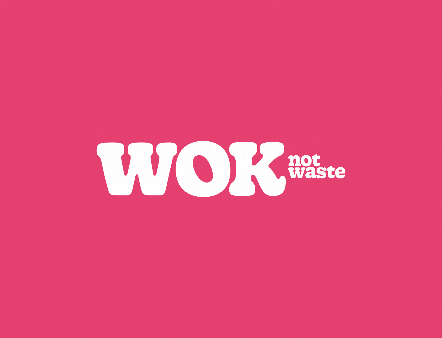
As part of my CareerFoundry UI course, I designed and animated a logo for a mobile app to explore core motion design principles, specifically anticipation and follow through. The logo is based on the Gooper Text typeface, whose lively, playful forms reflect the personality of the brand. The wordmark is arranged in the shape of a wok or pan—a subtle visual nod to the app’s name. The animation is carefully timed to create a smooth, engaging experience without delaying the user, reinforcing the brand’s tone while adding personality to the UI.