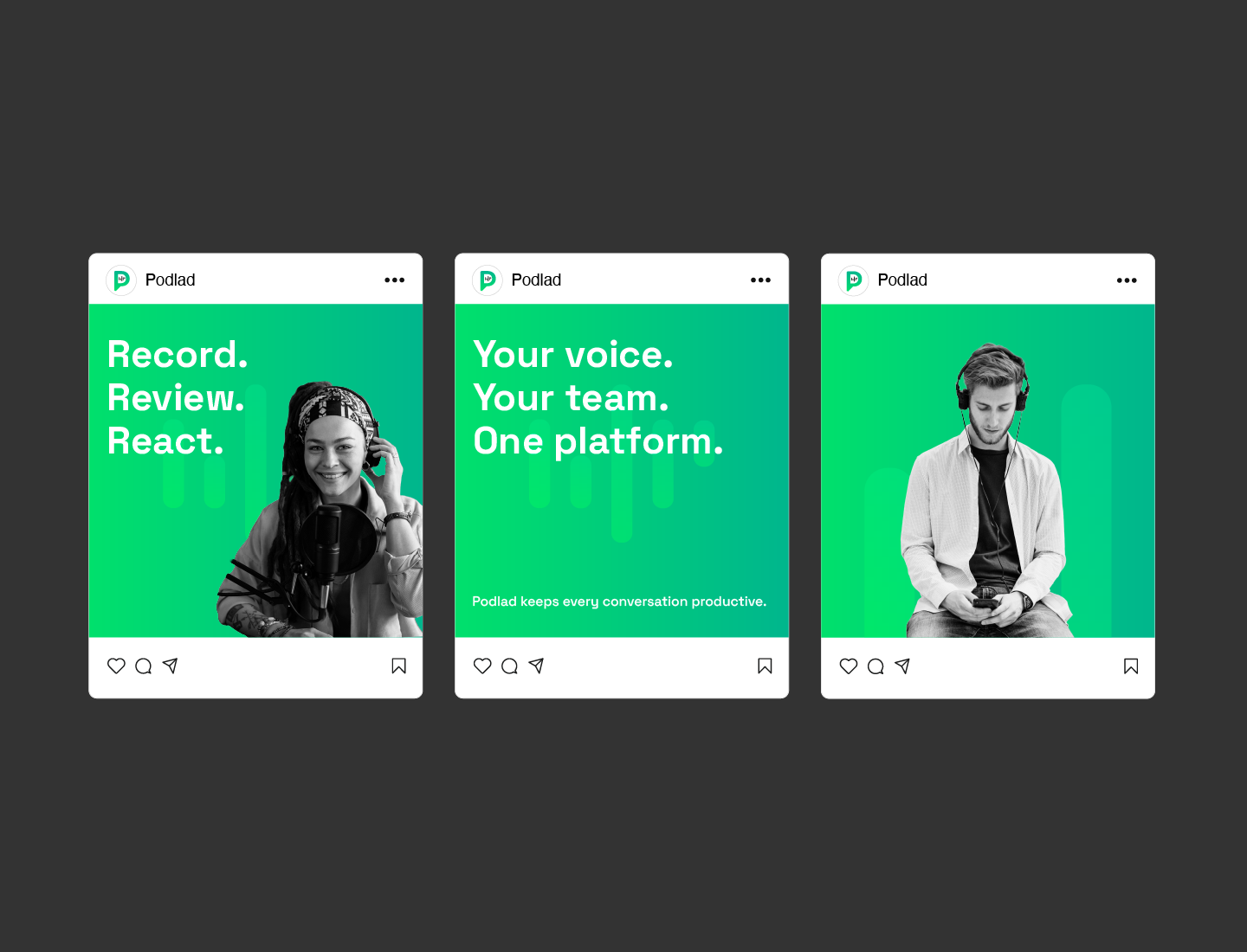
I led a comprehensive brand refresh for Podlad, a platform focused on Podcast Strategy, Production & Editing Services. The goal was to modernize its visual identity while preserving its core personality — creative, clear, and connected.
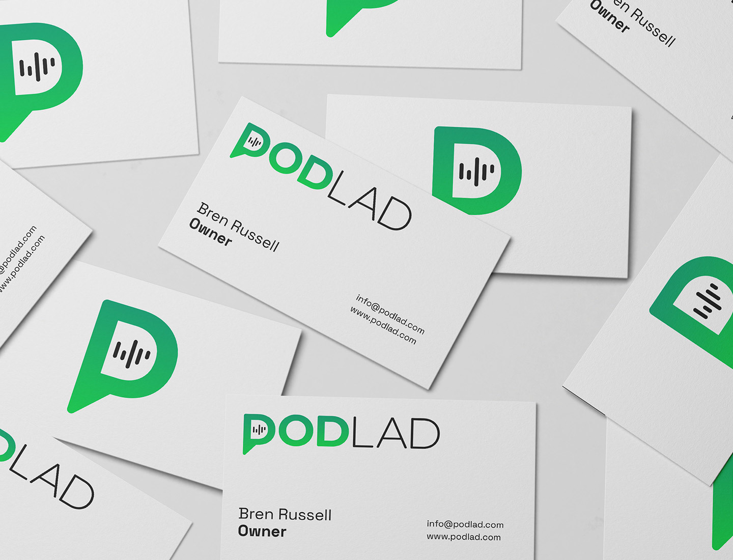
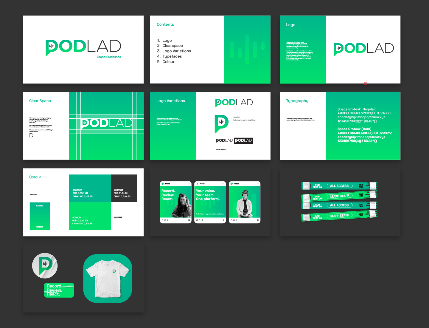
From redefining the color palette and typography to refining the logo and user interface elements, the new design system brings consistency across digital and physical touchpoints. I focused on building a flexible, scalable brand that reflects Podlad’s innovation and positions it for future growth.
This refresh not only sharpens Podlad’s visual presence but also enhances usability and brand recognition across platforms.
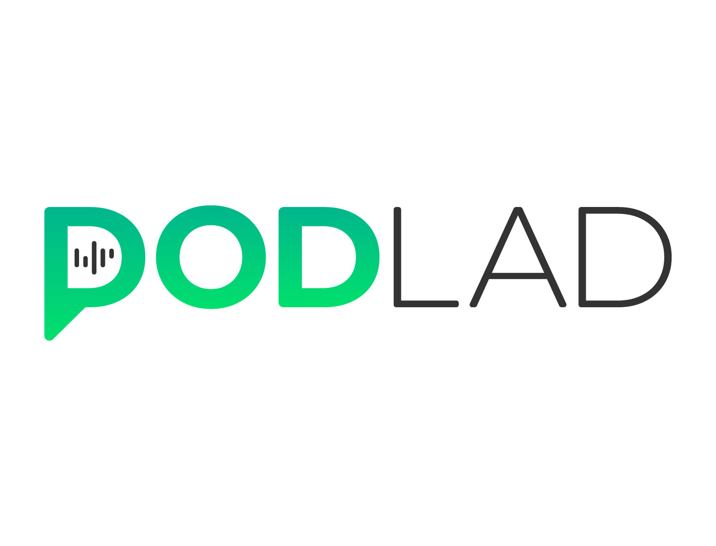
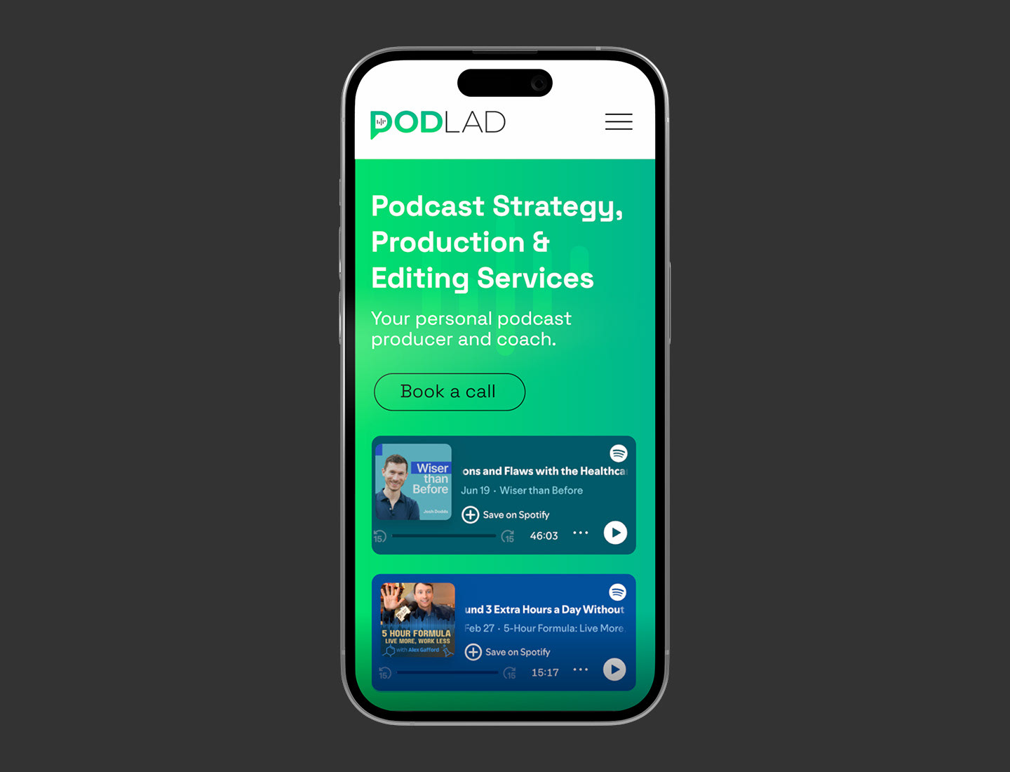
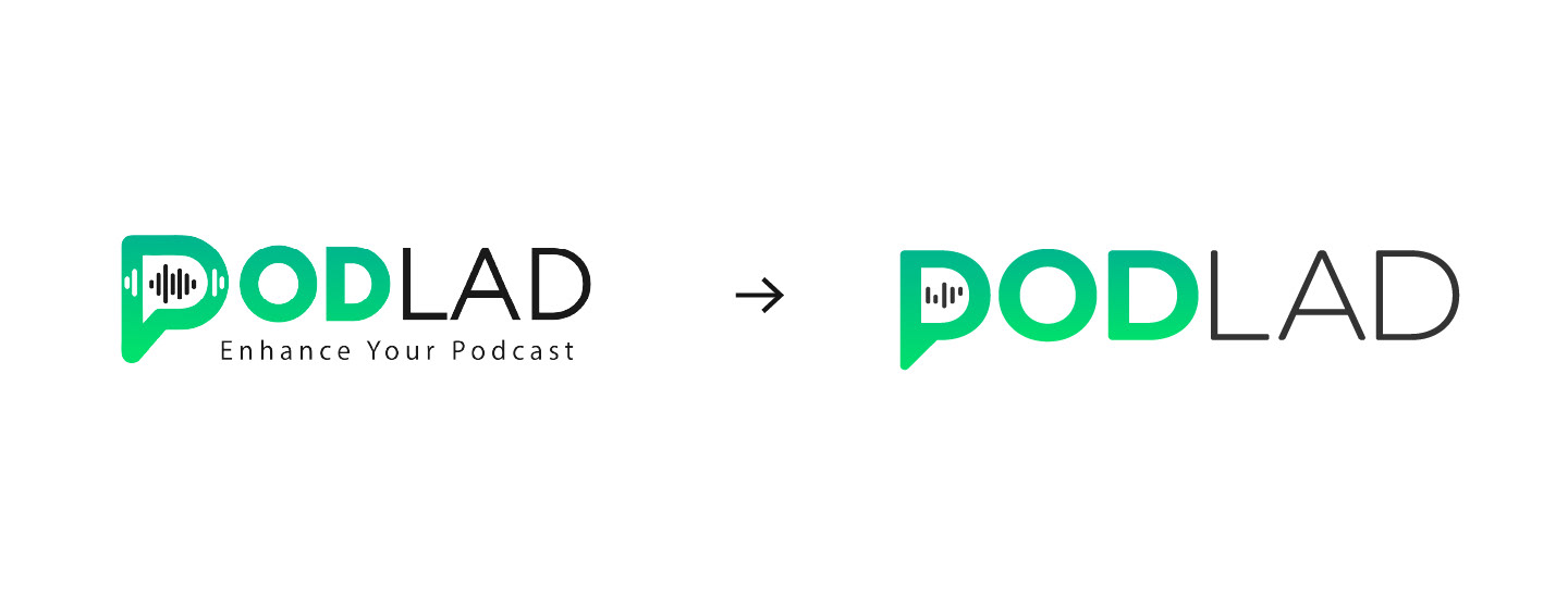
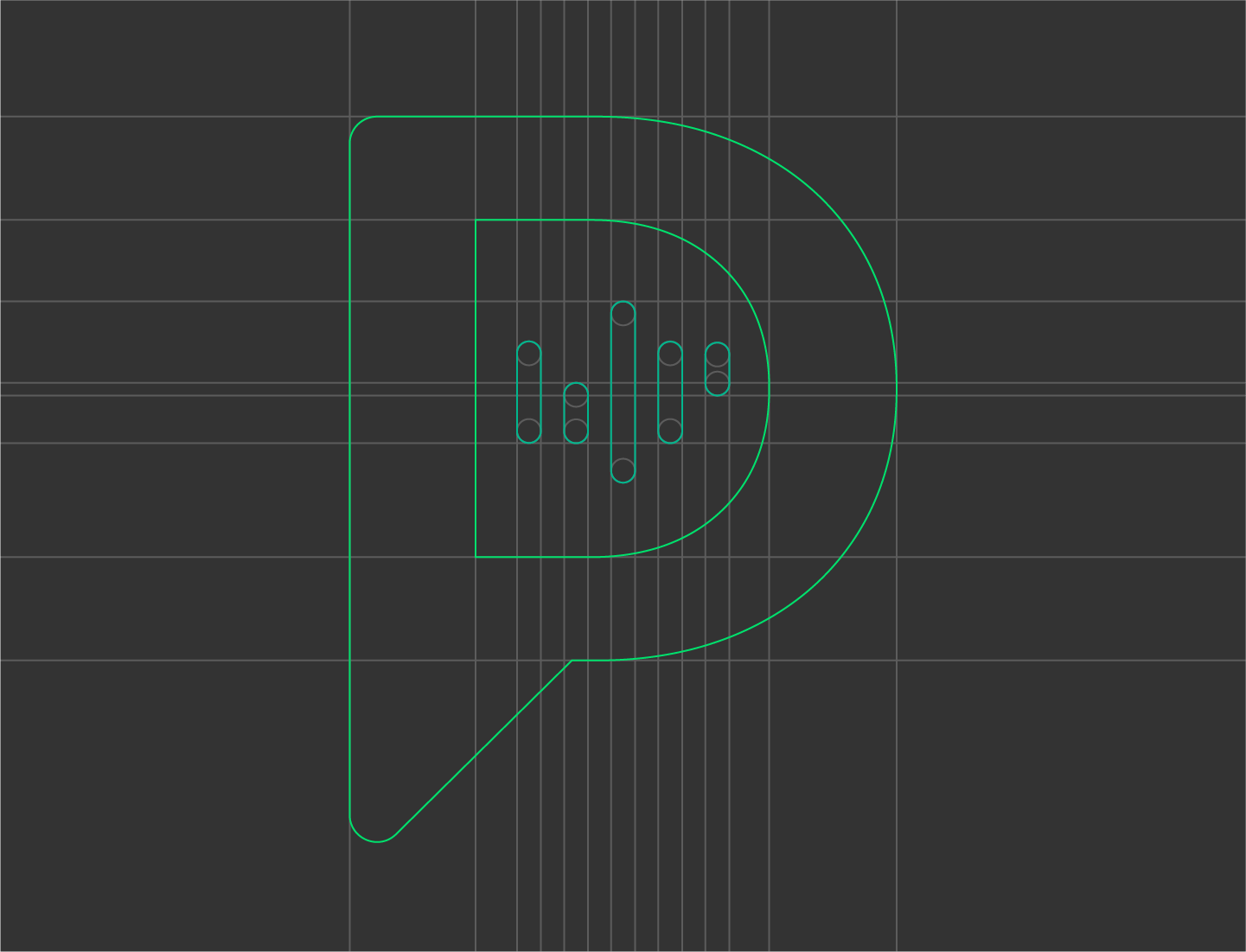
The redesign simplifies the original concept while maintaining its core identity. The speech bubble “P” icon now features abstract waveforms that subtly form the initials “br”, a personal nod to the founder. The updated typography, streamlined layout, and consistent gradient enhance legibility and scalability—perfect for modern digital use.